Sketching for UX Newsletter Issue #2 (August 2022)
My favorite resources
Here are the resources I really liked in August:
#1 One billion signatures
Built For Mars (Peter Ramsey) published this great analysis of DocuSign. While he explores the good practices inside the app, he also points out what could be improved. (I highly recommend his other case studies, too, especially if you work in fintech).
#2 The History of User Interfaces
I've always been fascinated by the evolution of user interfaces. I even have a folder where I collect old UIs :) Now here is a website that showcases the most important milestones:
#3 Designing Better Error Messages UX
Writing is designing. And writing good error messages is especially important. Vitaly Friedman released an awesome comprehensive article on this topic. He explains the two types of errors, too:
"Slips occur when users intend to perform one action but do another (e.g., when filling in a form on autopilot). Mistakes occur when there is a mismatch between the mental model of a user and the system." (You can read more about these types in Don Norman's famous book, The Design of Everyday Things.)
Btw. this is my UX Knowledge Base Sketch about Error messages:
#4 What I do, as a UX Lead…in 3 drawings
This is a short and simple article, I included it to show you the power of visuals. Eve Weinberg applied some lines to convey her message - it is very inspirational.
#5 Emily's Ultimate Guide to Sketchnoting Tools
Emily Mills is a great visual thinker, I highly recommend you to follow her work. In this downloadable pdf guide, she shares what her favorite sketchnoting tools are.
Pens, markers, notebooks, books and more
#6 The joy of doing ‘ugly’ sketchnotes
Eva-Lotta shares a very important point about taming our inner judge: "I had forgotten how freeing it is to just go let go and not worry about how my sketchnotes would look in the privacy of my secret notebook that nobody else would lay eyes on."
Rediscovering the joy of drawing fast, rough and ‘ugly’ while no-one is watching…
#7 Dive by Ridd (founder of Figma Academy)
Ridd's idea is that there are many-many 101 design courses, but there is a lack of deep dives, advanced-level courses.
Since it was announced on the 1st of September, it should not belong to the August issue of my newsletter, but it is so exciting that I can't wait to share this with you (and there is also a limited early bird reward, so you should know about this as early as possible - btw. there is no affiliation, I just love Ridd's work).
Advanced courses for designers who never stop learning
#8 UXcel platform
Speaking of courses - here are some more :) It is like the Doulingo of design, bite-sized knowledge chunks, quick exercises and challenges, lot of different topics for all levels. You should give it a go, completing some challenges might be a great coffee break activity.
#9 UXRConf 2022 Videos
If you are a UX researcher or a designer interested in research topics, you should watch the UXRConf's talks online, here is the link:
The premier event for researchers and anyone who loves research.
#10 Stuck? Diagrams help.
Abby Covert, author of the awesome book, "How to Make Sense of Any Mess" has released her new book.
"This book teaches you how to diagram. There are plenty of books cataloging and analyzing beautiful diagrams that helped someone or a group of someone’s who were stuck. And many books provide diagram templates or visualization methods that help in certain contexts and on specific types of problems. But there is a surprising lack of education on diagramming. Like where do you start? How do you know what to do first, next and last? And how do you know if what you are doing is working? This book aims to fix that."
An IA who loves to make sense of messes
#11 The Twisted Life of Clippy
Clippy, Microsoft's virtual assistant was a failed attempt at anticipating user needs. Spamming users with undesired suggestions doesn't provide a good user experience. This article explores the history of this iconic personal character.
New UX Knowledge Piece Sketch
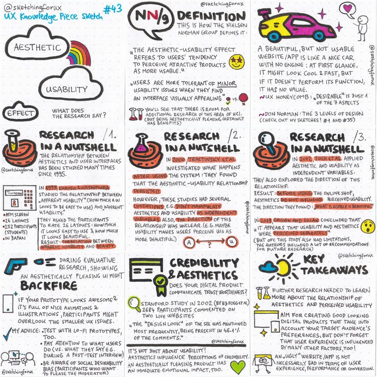
My newest sketch is about the aesthetic-usability effect.
There are many-many resources out there that just echo the definition you can find on the Nielsen Norman Group's website. But there is so much to it, as you'll see if you check out my sketch & article.
Spoiler: I believe that you should aim for creating great looking digital products. :) But the research that explores the relationship of aesthetic and usability shows that it is a bit more complex than that. I hope you enjoy reading my little summary as much as I enjoyed writing it.
Coupon codes for my Udemy courses
Development aspects for UX course
Thanks for reading my newsletter, I hope you enjoyed it!
As for the 100-day UX Visual Library Building Challenge ebook: I'm trying my best, but I have so many other tasks to focus on right now, but don't worry, you'll be able to continue / start the challenge soon! Same goes for the Sketching for UX Workbook, I'm going to upload it to Gumroad in the coming weeks.
Keep on sketching,
Krisztina


