Sketching for UX Newsletter Issue #1 (July 2022)
My favorite resources
Here are the resources I really liked in July:
#1 GuidesLab Figma plugin
Matt Wierzbicki is a great creator and Figma teacher. He has recently released his new Figma plugin in which you can learn design and Figma from other community members. You can also share your Figma knowledge by submitting your guides.
GuidesLab is a plugin for Figma in which you can learn UI design and Figma from community members.
#2 The case study factory
Fabricio Teixeira and Caio Braga, editors of uxdesign.cc wrote an excellent UX essay about the "case study factory" we see these days. The authors ask "Keeping in mind the hiring manager’s time and attention constraints, how can designers make their work stand out?"
#3 Designing Design Workshops: Beyond Dot-Voting
Stephen P. Anderson wrote a nice article on why dot voting might be problematic. In his article, Dan Brown outlines 3 alternative workshop activities.
#4 Museum of Failure
Have you heard of Amazon Destinations, the hotel-booking website that lasted six month? Or the story of Sony Betamax? You should check out the virtual tour of Museum of Failure.
"Innovation and progress require an acceptance of failure. The museum aims to stimulate productive discussion about failure and inspire us to take meaningful risks."
159+ failures you can learn from
#5 The forgotten benefits of “low tech” user interfaces
"On many projects, I’ve also made the assumption that higher technology user interfaces enable better user experiences. But, a recent project reminded me that low-tech user interfaces can be superior to high-tech ones." A very inspiring piece by Jonathan Kendler on what we can learn from low-tech UIs, and how we can use this knowledge to create better high-tech experiences.
Seemingly outmoded technologies sometimes hold the key to better user experiences.
#6 Growth.design's new case study on Cookie consents
If you haven't heard of growth.design, I'm sure that now you are going to bookmark this website. The guys behind it publish awesome design walkthroughs that are jampacked with UX and cognitive psychology tips. Their newest case study is about a very frustrating design pattern: cookie consents. (Speaking of frustrating design patterns, check out this awesome UX talk by Vitaly Friedman delivered at the Amuse UX Conf)
This case study shows how a cookie consent prompt went over the ethical line.
#7 What if you started your UX process away from a computer?
The subtitle of Chris R. Becker's excellent piece is "A case for sketching-first UX". I guees I don't need to tell you that I love sketching :D
"Spend more time in the experimentation process and share more of your early sketches both with your team member and with your clients. Advocate for your team to sketch more and your team just might have more fun and because of that solve problems faster."
#8 Designing A Perfect Pricing Page UX
I don't know about you, but I'm in love with detailed articles that explores a certain design pattern. Vitaly Friedman is a master of such articles, his latest one is about designing pricing tables & pricing pages. The underlying question is: how do users prefer comparing prices?
In this series of articles, we highlight design patterns and techniques to design better interfaces.
#9 Why we built an anti-social tool
As designers, we should design with responsibility. For instance, the designer of infinite scroll, Aza Raskin said: "One of my lessons from infinite scroll: that optimizing something for ease-of-use does not mean best for the user or humanity." In his article, Tobias van Schneider explains why they built a completely different "social media" app.
"Our real minds need a break. It's our opinion that the social, data-hungry nature of apps today is damaging our real minds, and sapping us of our energy and creativity. It’s time to get it back."
#10 The First 20 Hours of Sketchnoting
Doug Neill's newest YouTube video is about Josh Kaufman's TED Talk, applied specifically to the skill of sketchnoting.
New UX Knowledge Piece Sketch
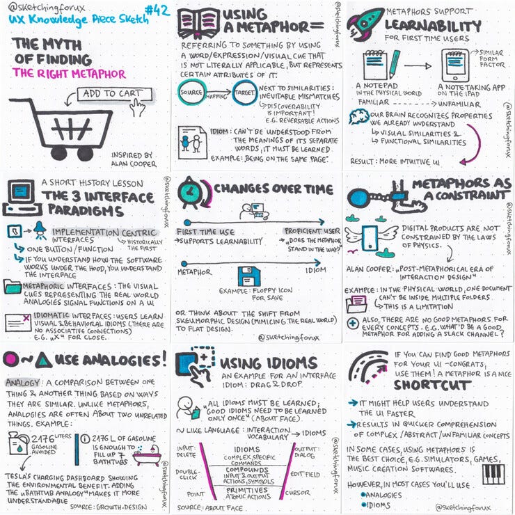
My newest UX Knowledge Piece Sketch is about an interaction design topic: using metaphors, analogies and idioms in your designs.
Here is the most practical part of the article (so that you can directly apply this technique):
"An analogy is a comparison between one thing and another thing based on ways they are similar. Unlike metaphors, analogies are often about two unrelated things: they rely on one similar attribute.
Here is an example: the growth.design team created a redesign for Tesla’s charging dashboard. The savings widget tells you how many liters of gasoline was avoided (showing the environmental benefit). But can you imagine 2176 liters? Adding a “bathtub analogy” (it is “enough to fill up7 bathtubs”) makes it much more understable. The one similar attribute they used in this example is that both gasoline and water are liquids, so that both of them could fill a bathtub in a similar way.
So always think about what could be the similar characteristic that you can use for the comparison! [...]."
Coupon codes for my Udemy courses
Development aspects for UX course
Thanks for reading my newsletter, I hope you enjoyed it!
A little progress report on the 100-day UX Visual Library Building Challenge ebook: I'm around halfway through, hopefully I'll be able to publish it (as a free ebook) in late September (early October).
And if you are interested in the Sketching for UX Workbook: I'm going to upload it to gumroad soon, so that you'll be able to download it (it's going to be a "pay what you want" product, too).
Keep on sketching,
Krisztina


