Meet the users where they are: offer contextual help, UI density & more
Sketching for UX Newsletter Issue #21 - my favorite design resources I discovered last month (May, 2024)
Dear subscriber,
I hope you’ll find some useful pieces in this collection, please let me know if you have any feedback on the content of this newsletter!
✏️ My work
Webexpo 2024 Conference
As you might already know, I’m a community partner of Webexpo. Sadly I couldn’t attend the conference in-person this year, but thankfully almost all the talk recordings are available. I’m going to share some of my sketchnotes soon, until then, here are 3 talks you shouldn’t miss:
Signal to noise in the age of misinformation by Nick Fine (source validity is such an important topic, I have been working on an article about my “favorite” design myths for a long time, e.g. one of my favorite examples is how Miller’s law is often misinterpreted and misused)
Don’t worry - the design system takes care of accessibility! by Geri Reid
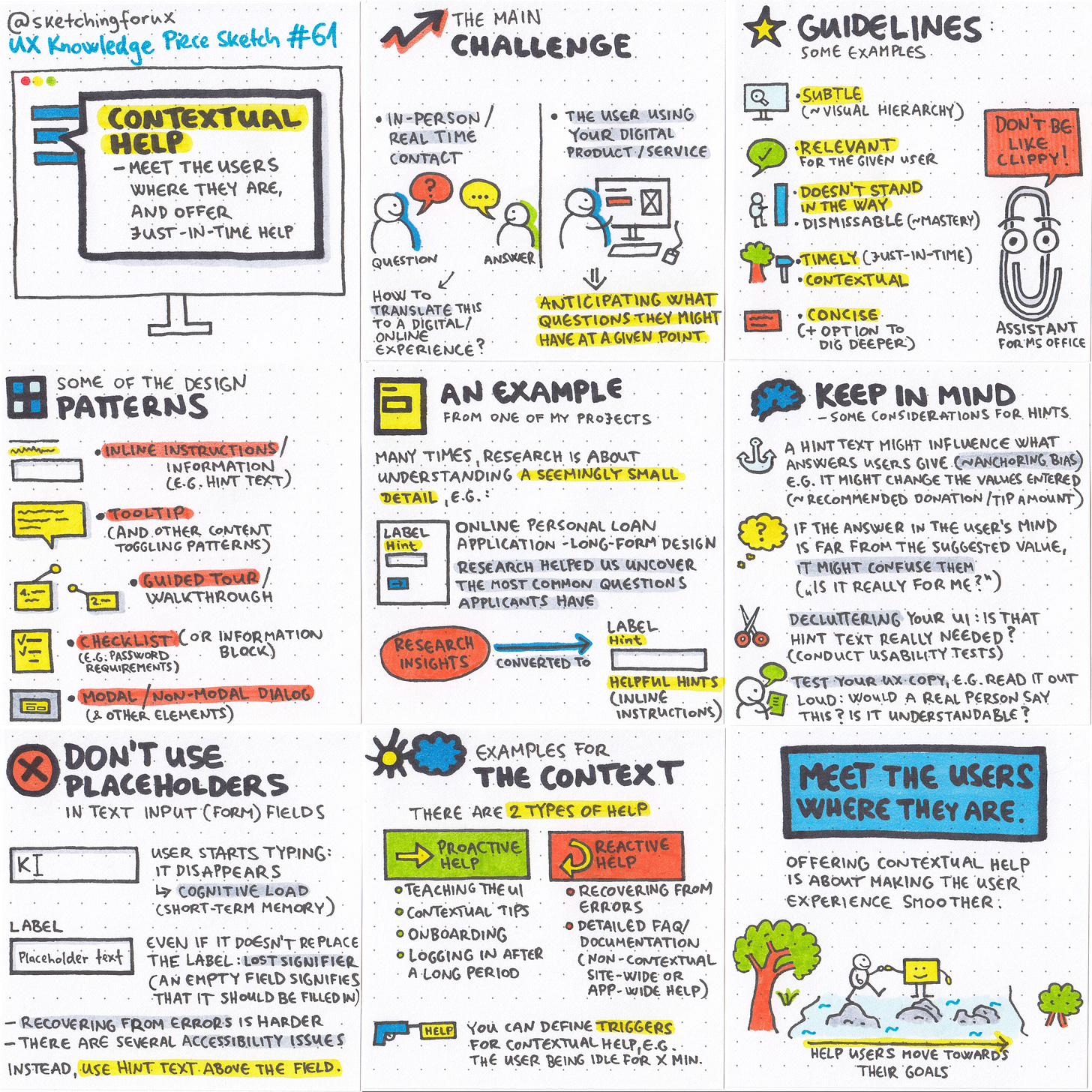
✏️ Contextual help - my new UX Knowledge Piece Sketch
My newest sketch is about offering just-in-time help to your users. Check out my sketch & detailed article here soon.
✏️ Favorite resources
Here are my favorite discoveries of May, 2024:
#1 What telephones can tell you about good design by Kelly Smith
”Every time you pick up your mobile phone to make a call you’re presented with the layout below. But has it ever occurred to you to wonder why the numbers are arranged like this? Or why the calculator on your phone is arranged in the opposite direction?”
#2 Designing Search UX in 2024 with Vitaly Friedman 🇺🇦🏳️🌈 - 3-hour long free webinar
As Vitaly said, we have been doing this design/UX thing for 25 years, we should be able to design a proper search box at this point. :)
You can even download all the slides!
#3 Low fidelity design is higher up the value chain by Pavel Samsonov
”But the biggest value of design is not delivering a thing faster. It’s delivering the right thing faster. Designers who don’t see value in working lo-fi are focused on the area they are allowed to contribute to: visual fidelity. But lo-fi design is a tool for conceptual definition.”
#4 UI Density - What UI density means and how to design for it
This great piece by Matthew Ström describes the different types of density, and how to design for these.
#5 Hiding complexity to create effortless onboarding
Peter Ramsey’s newest case study really makes you think about the potential trade-offs of making something effortless for the users. ”There are two things I believe to be true about Slack: The individual key flows feel effortless and simple. The cumulative experience feels noisy and distracting.”
#6 5 times “smart” copy swung into graveyard humor by Rita Kind-Envy
Content design (and UX writing) is a topic really close to my heart. Rita collects cases of “UX copy gone wrong” (a related book I highly recommend: Eric Meyer & Sara Wachter-Boettcher: Design for Real Life).
#7 What no one tells you about personalization by Slava Polonski #UX #AI #ML
”Imagine walking into a store where every shelf is filled with items that seem chosen just for you. The lighting adjusts to your preference, the music is your favorite playlist, and the store clerk greets you by name, already anticipating your needs. It seems like a dream of perfect personalization. But at what cost? In exchange for this tailored experience, you grant a full, X-ray view of your life.”
#8 The Creative Cold Start Problem by Better by Design
”I want to explore a few ideas for unblocking creative cold starts. Let’s explore a handful of simple reframes for getting over that first hurdle and on your way to making something great.”
#9 Why do users prefer certain design? Insights from the landscape theory by Dejan Blagic
”It’s worth considering how exploration can positively impact user experience. While we have mostly focused on the understanding side, our users may need an adventure of discovery.”
#10 Tools and tactics for modern user research - Deep Dives podcast by Ridd
Ridd and Noam discuss really interesting points about doing research, e.g. how to share the results of your research like a master storyteller. “It’s not a list of bullet points. It’s not a quick Slack message with an insight. It’s a story.”
+1 I find Christopher Butler’s Visual Journal really inspiring! Check it out here.
🔥 Deals & recommended products
My Udemy courses
Newest course: How to train your designer eye - €12.99
Sketching for UX Designers course - €12.99
Be a better designer by understanding development aspects course - €12.99
My (pay-what-you-want) books
Recommended design courses
Master Gorgeous UI Design Course by Pablo Stanley & his team
Figma Academy by Ridd (use the code SKETCHINGFORUX to get $100 off)
Into UX Design (UX research & concept validation) by Anfisa Bogomolova (use the code SKETCHINGFORUX to get 10% off)
The Ultimate UI Design Mastery Bundle is an epic starting point if you want to become a UI designer. I attended their Advanced Figma course, so I experienced their teaching style myself. If you join via my link, you’ll support my work!
Other deals
Being part of the 10x Designers Community has been one of the best experiences in my professional life as a designer. Join me on this learning journey, let’s grow together! (Sale: $99 instead of $129 for 3 months)
As you know, I find collecting and analyzing design inspiration a very important skill, and I became an advocate of Mobbin, join with my link to support me with a couple of dollars, I’d really appreciate it!
Pip Decks: sets of oversized, beautifully designed cards that’ll help you become a better design professional in many areas, like storytelling and workshop facilitation.
Thanks for reading my newsletter, I hope you enjoyed it! 💙
Krisztina


