
👀How to test visual design: the first impression test & more
Sketching for UX Newsletter Issue #32 - my favorite design resources I discovered in the last 2 months (June-July, 2025)

Hey dear subscriber 🌞,
This is a “summer edition”, a double issue of the previous two months. We took some days off with my family (I’m a mom of 2, traveling with a 3-year old kid and a 8-month old baby is an interesting challenge — with some awesome moments :D )

This issue is about
Getting inspired by some features of a model railway museum
Testing visual design: the first-impression test (5-second test) — the new UX Knowledge Piece Sketch
15 design resources I loved the most in June & July
I hope you’ll find something valuable! 💎
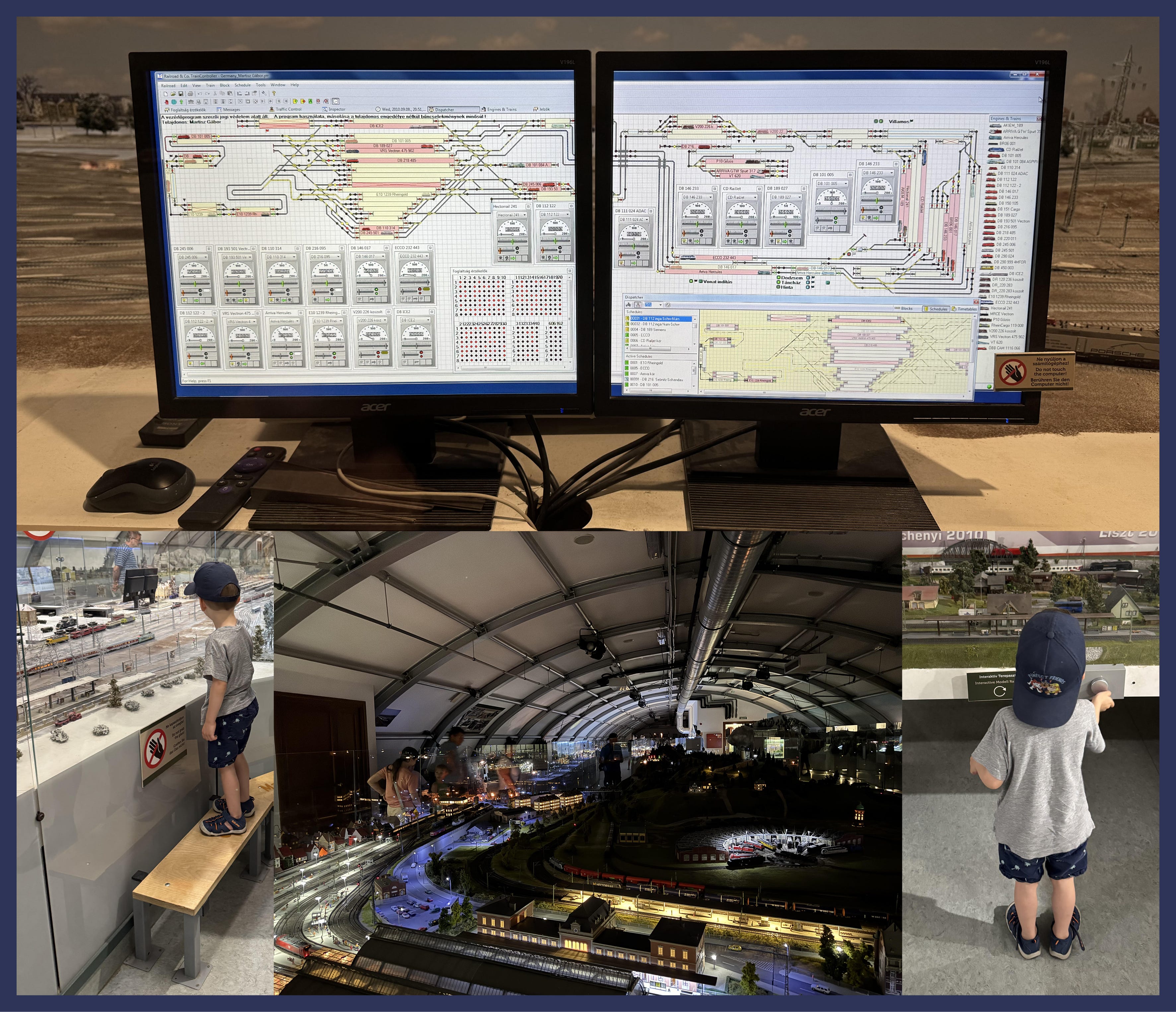
🚂 Getting inspired by a museum
During our holiday, we visited some museums, too, for instance a model railway museum. The previous newsletter issue was about getting inspired by the real world around us, these are some of the things I noticed and documented:
the model trains were controlled by a software called Railroad & Co. TrainController, it was great to see how all the routes and engines were displayed
there was a nice accessibility feature: kids could stand on a platform to better see the models (bottom-left corner)
they applied a “dark mode” :) Once per hour, visitors could experience the nighttime appearance of trains, buildings, and terrain
there was an interactive model railway that visitors could control by using a knob — it was interesting to observe how intuitive it was for my 3-year old, the affordance (knob for turning) really worked (bottom-right corner)
Next time you visit a museum, try to observe some design solutions, document them, and I also encourage you to share your findings! (I talk about this activity in greater detail in the How to train your designer eye course.)
✏️ First-impression testing & how to optimize it
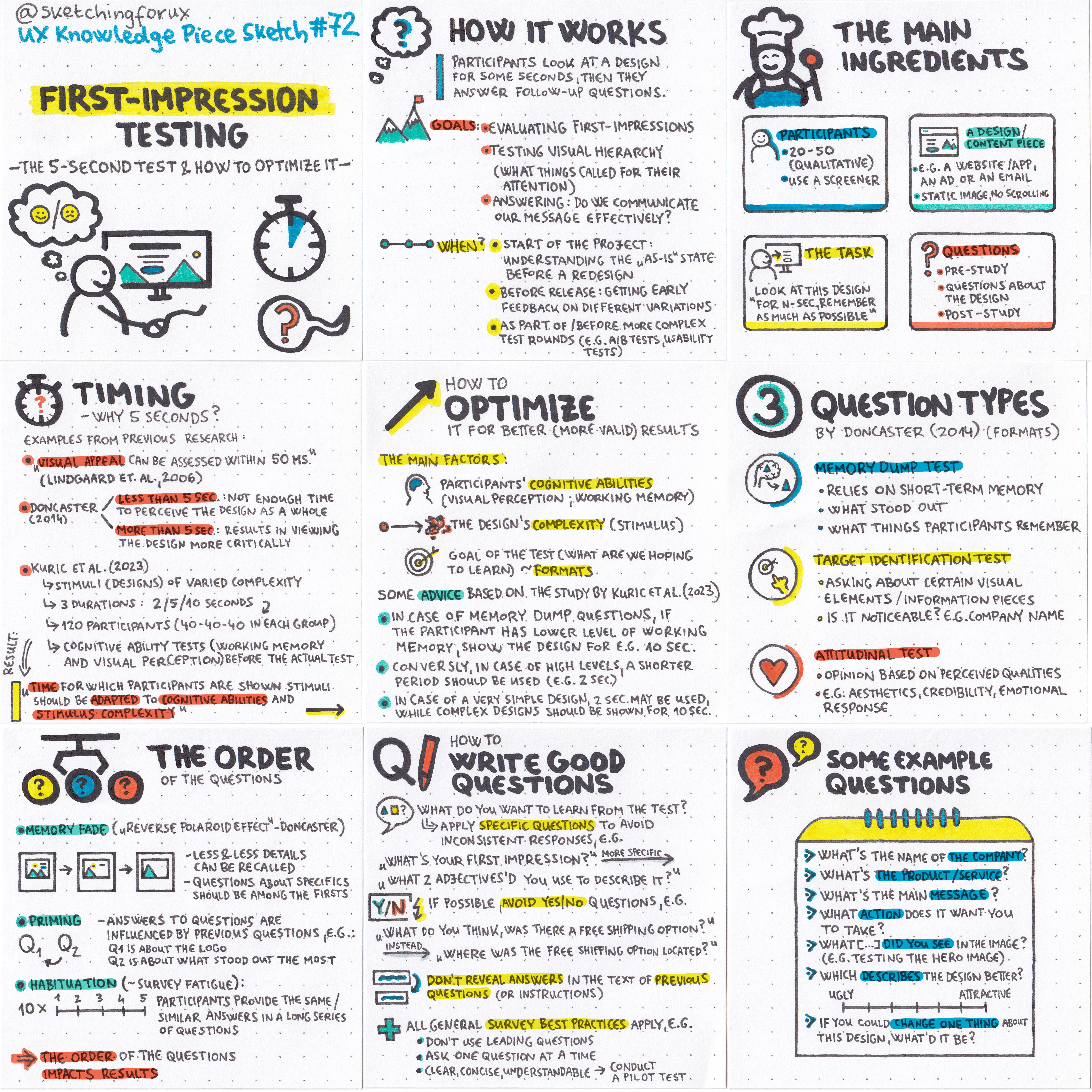
During a 5-second test, users are shown a design or content piece (e.g. a website or an app) for 5 seconds, then asked questions about what they remember or noticed. Goals include: evaluating first impressions, visual hierarchy, and whether key info or CTAs are immediately clear or not.
However, research suggests that this 5-second duration is not a “one-size-fits-all” solution, and it should be optimized based on the participant’s cognitive ablities and the design’s complexity.
Read my sketch & detailed article here soon (I’ll include many-many examples.)
✏️ Favorite resources
Here are my favorite discoveries of June-July, 2025:
#1 Designing for the Eye by Niko Kitsakis
”This article highlights a special aspect of both visual design and architecture: Optical corrections” Another great article in this topic: Optical effects in user interfaces by Slava Shestopalov
#2 How to write surveys that actually work: lessons from Strava by Rosie Hoggmascall
A great analysis of Strava’s survey — pointing out its “green flags” and its biggest flaw. (My sketch about surveys)
#3 AI is eating the Internet
”Even Google, realizing its core search business is at risk, has decided to commit seppuku rather than be usurped by outsiders. Google is now rolling out AI-generated answers in search results, essentially cannibalizing its own traffic.”
Related research: Google users are less likely to click on links when an AI summary appears in the results
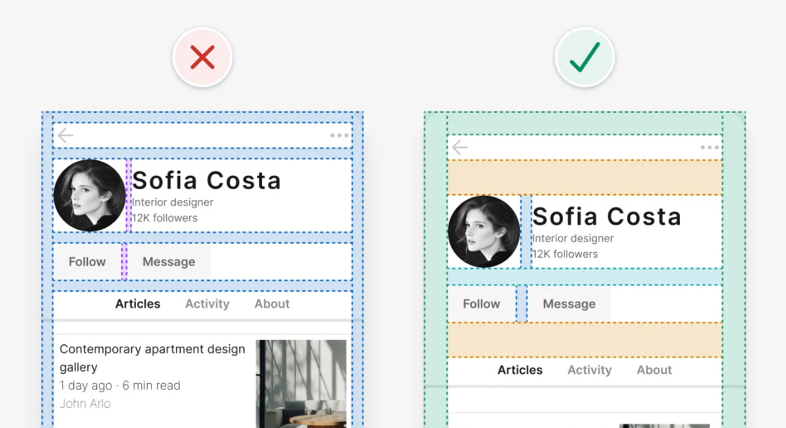
#4 14 logic-driven UI design tips to improve any interface by Adham Dannaway
Adham is one of the best teachers when it comes to learning UI design (his book, Practical UI, is one of my favorites)
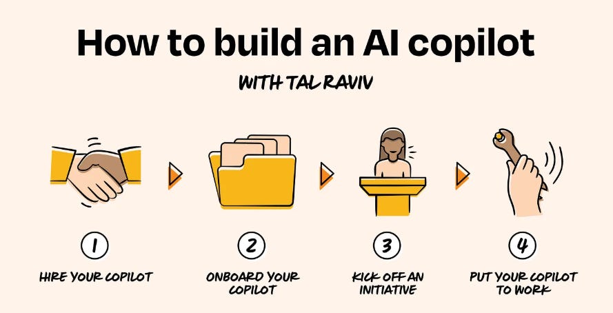
#5 Build your personal AI copilot by Tal Raviv
“A guide to using AI as a long-term thinking partner (including prompts to get you started)”
#6 5 things I learned from 5 years at Vercel by Lee Robinson
I love these kind of summaries, these inspire me to write about the “chapters” of my own design career. Another one I really liked: Emily Not Found
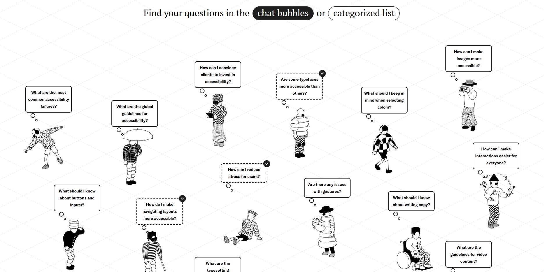
#7 How to Convince People to Care and Invest in Accessibility by Stéphanie Walter
”This talk, article, is for anyone who’s ever said “we need to make this accessible,” and got ignored, brushed off, or told, “We’ll do that later.””
Another accessibility-related resource I discovered is Design Beyond Barriers, a great guide that explains many different aspects.
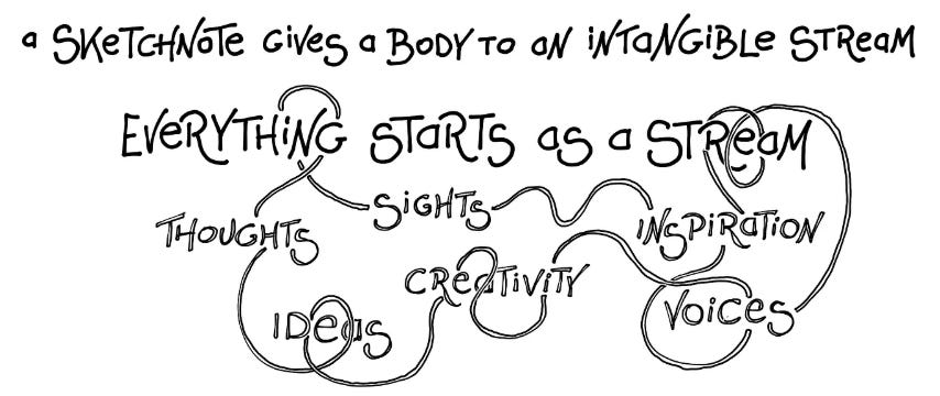
#8 Travel sketchnotes — Since this is a “summer edition”, here are some travel sketchnoting resources:
Create memories by sketching by Chris Spalton
Talking about Travel Sketchnotes on the Sketchplanations Podcast by Eva-Lotta Lamm (podcast episode)
Sketchnoting Scotland: How visual notes made my travels more meaningful by Mike Rohde
#9 Supporting “Power Users” Isn’t Enough: 3 Complex-App User Types by Kate Kaplan
”Complex-app users don’t always fit neatly into “novice” or “expert” labels. Designing for Legacy, Legend, and Learner users leads to more inclusive, effective systems.”
#10 Return to the Roots: Sketchnote by Mauro Toselli
Read about — and get inspired by — Mauro’s sketchnoting journey :)
#11 The secret of good metaphors by Louis Charron
”One of metaphors’ most powerful aspects is their ability to bring distant concepts within reach of our human scale.”
My related sketch: The Myth of Finding the Right Metaphor for your UI
#12 The UX butterfly effect by Martin Tomitsch
”The law of unintended consequences observes that every decision made can have both positive and negative outcomes that were not foreseen by the person making the decision.” This article is from the book, Designing Tomorrow.
Impact Ripple Canvas template
#13 One Million Screenshots
An unconventional way of getting some design inspiration :) Zoom into the web's top homepages
#14 Masterclass in Storytelling (for beginners) with Shaan Puri by How I Write
”We deconstruct everything from popular movies to business origin stories to viral Twitter threads.”
#15 I Spent 90 Days Rebuilding My Brain. Here's What I Learned. by Joan Westenberg
”There's a version of your mind you haven't visited in a while. A version that's slower, sharper, and far more capable than the fragmented one most of us live with. This is an invitation to meet that version again.”
🔥 Deals & recommended products
My courses on Udemy (€12.99 each)
My free (pay-what-you-want) books
Recommended design courses
Supercharge Design All access by Andrija Prelec
Master Gorgeous UI Design Course by Pablo Stanley & his team
Figma Academy by Ridd (use the code SKETCHINGFORUX to get $100 off)
Other deals
Mobbin 2.0 is here with many new exciting features like flows, advanced search and an all-new library! Join with my link to support me with a couple of dollars, I’d really appreciate it!
☕ You can also support me by buying a coffee on ko-fi.com.
Thanks for reading my newsletter, I hope you enjoyed it! Please let me know if you have any feedback!
Krisztina